

How To Choose A Web Design Agency in 2023? An Ultimate Guide.
November 16, 2023
Local vs International SEO: What’s the Difference?
December 20, 2023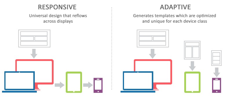
In the ever-evolving landscape of web development, two design approaches have emerged as prominent contenders for creating user-friendly and visually appealing websites: Adaptive Web Design (AWD) and Responsive Web Design (RWD). Both approaches aim to enhance the user experience across various devices, but they differ in their methodologies and implementations. In this comprehensive exploration, we will delve into the nuances of Adaptive and Responsive Web Design, comparing their strengths, weaknesses, and applications to determine which the superior choice for different scenarios is.
Understanding Adaptive Web Design (AWD)
Adaptive Web Design is a strategy that involves creating multiple versions of a website, each tailored to a specific set of devices or screen sizes. Instead of relying on a single, flexible layout like Responsive Design, AWD utilizes predefined layouts that are optimized for specific breakpoints. These breakpoints are determined based on the most common screen sizes or devices used by the target audience.
Advantages of Adaptive Web Design
Enhanced Performance:
A key advantage of AWD is its potential for enhanced performance. By serving specific layouts tailored to each device category, unnecessary elements can be excluded, leading to faster load times and a smoother user experience. This can be particularly beneficial for users on slower networks or less powerful devices.
Optimized User Experience:
Adaptive designs allow developers to fine-tune the user experience for each device category. This customization ensures that users receive a layout and navigation structure that is optimized for their specific device, leading to a more intuitive and satisfying experience.
Greater Control Over Design:
With AWD, designers have greater control over the visual elements of each layout. This enables them to create pixel-perfect designs for each device, ensuring that the website looks polished and professional across the entire spectrum of devices.
Challenges of Adaptive Web Design
Increased Development Time and Cost: ‘
Creating multiple versions of a website for different devices requires more time and resources, potentially making AWD a more expensive option.
Limited Flexibility:
AWD may struggle to adapt to new devices or screen sizes that were not considered during the initial development, leading to a less flexible design
Maintenance Challenges:
Updating content or making design changes across multiple versions of the site can be challenging and time-consuming.
Understanding Responsive Web Design (RWD):
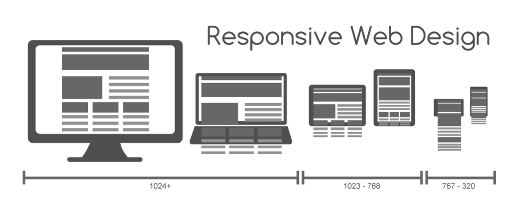
Responsive web design, commonly known as RWD, takes a different approach by utilizing a single fluid layout that adapts dynamically to different screen sizes. The layout is built using flexible grids, images, and media queries to ensure that the content rearranges itself seamlessly based on the user’s device characteristics.
Advantages of Responsive Web Design:
Cost-Effectiveness:
RWD is often considered more cost-effective because it involves creating a single layout that adapts to various devices. The development process is streamlined, and ongoing maintenance is simplified, as there’s no need to create and update multiple layouts.
Future-Proofing:
Responsive designs are inherently more adaptable to new devices and screen sizes. The fluid nature of the layout allows it to respond effectively to changes in the technology landscape, providing a degree of future-proofing that can be advantageous in a rapidly evolving digital environment.
Consistent Branding:
With a single layout, responsive designs ensure consistent branding and user experience across all devices. This cohesiveness contributes to a strong brand identity and helps users feel familiar with the website, regardless of the device they are using.
Challenges of Responsive Web Design:
Performance Considerations:
Responsive designs may face challenges in terms of performance optimization. The same layout must cater to a wide range of devices, potentially leading to slower load times on certain devices or network conditions.
Less Control Over Device-Specific Optimization:
Unlike AWD, where designers have precise control over each layout, RWD may limit the ability to optimize the user experience for specific device categories. Some compromises in design may be necessary to maintain a consistent layout across different screens.
Choosing the Right Approach: Adaptive vs Responsive Web Design

The decision between Adaptive and Responsive Web Design depends on various factors, including the project requirements, target audience, and budget constraints. Here are some scenarios where one approach might be more suitable than the other:
Optimal Performance on Specific Devices:
If performance on specific devices is a top priority, and the target audience predominantly uses those devices, Adaptive Web Design might be a better choice.
Cost-Effective Solution for Broader Reach:
For projects with limited resources and a need for a broader reach across various devices, Responsive Web Design provides a cost-effective solution.
Complex and Feature-Rich Websites:
Projects with complex layouts or extensive features may benefit from the precise control and customization offered by Adaptive Web Design.
Future-Proofing and Scalability:
If future-proofing and scalability are crucial considerations, Responsive Web Design’s flexibility may be advantageous as it adapts well to new devices and screen sizes.
Advanced Techniques in Adaptive Web Design:
Dynamic Serving: Adaptive Web Design can implement dynamic serving, where the server responds with different HTML and CSS based on the user’s device. This technique allows for highly customized content and layouts tailored to specific devices, ensuring an optimized user experience.
Client-Side Adaptation: To enhance user interactivity, some Adaptive designs incorporate client-side adaptation, where the browser dynamically adjusts the content presentation based on the user’s device capabilities. This can lead to a more seamless and responsive feel for the end user.
User Preferences: Adaptive designs can take user preferences into account, allowing visitors to customize their experience based on factors such as font size, color schemes, or content prioritization. This user-centric approach adds a layer of personalization to the design.
Emerging Trends in Responsive Web Design:
CSS Grid and Flexbox: Modern Responsive Web Design often leverages advanced layout techniques like CSS Grid and Flexbox. These provide more control over the arrangement of elements on the page, allowing for intricate and flexible designs that adapt well to different screen sizes.
Dark Mode Support: With the increasing popularity of dark mode across devices and applications, responsive designs are incorporating support for this feature. Implementing stylesheets that seamlessly switch between light and dark modes enhances the visual experience for users and aligns with current design trends.
Web Components: Responsive designs incorporate web components, which are reusable and encapsulated elements that can be easily integrated into different parts of a website. This modular approach simplifies development and maintenance while promoting consistency across various devices.
Tools and Frameworks: Adaptive vs Responsive Web Design
Adaptive Web Design Tools:
Tools like WURFL, DeviceAtlas, and Tera-WURFL aid in device detection and optimization in Adaptive Web Design. These tools provide databases of device capabilities, allowing developers to tailor content based on precise device specifications for an optimal Adaptive vs Responsive Web Design experience.
Responsive Design Frameworks:
Frameworks such as Bootstrap, Foundation, and Tailwind CSS offer pre-built components and grid systems that facilitate the development of responsive websites. These frameworks provide a foundation for designing layouts that automatically adapt to different screen sizes.
Best Practices for User Experience:
Performance Optimization Across Devices:
Both Adaptive and Responsive designs should prioritize performance optimization. Techniques such as minification of assets, image compression, and asynchronous loading contribute to faster load times, improving the user experience across devices.
Progressive Enhancement for Responsiveness:
In Responsive Design, progressive enhancement is key. Start with a basic layout that works across all devices and progressively enhance it for larger screens. This ensures a fundamental level of usability for all users while delivering additional features to those with more capable devices.
Cross-Browser Compatibility:
Regardless of the chosen approach, ensuring cross-browser compatibility is crucial. Regular testing across popular browsers and devices helps identify and address any inconsistencies in the design, providing a more reliable experience for users.
Accessibility Considerations:
Adaptive Accessibility Features:
Adaptive designs can incorporate device-specific accessibility features, such as larger touch targets for mobile users or keyboard navigation enhancements for desktop users. Tailoring accessibility measures to specific devices ensures a more inclusive experience.
Responsive Font Sizing:
Responsive Web Design can utilize viewport units (vw, vh) or media queries to implement responsive font sizing. This ensures that text remains readable and aesthetically pleasing across a range of devices and screen sizes.
Conclusion:
As technology continues to advance, web designers and developers have a plethora of tools, techniques, and best practices at their disposal to create adaptive and responsive websites. The optimal choice between Adaptive and Responsive Design depends on project-specific requirements and considerations. Combining elements from both approaches or adopting a hybrid strategy can provide a balanced solution that caters to diverse user needs and device landscapes. Staying informed about the latest trends and continually refining design approaches will be essential for creating web experiences that stand the test of time.
